PanoramicIllusion
Wednesday, February 28, 2007
Friday, February 23, 2007
Wednesday, February 21, 2007
Friday, February 16, 2007
Wednesday, January 31, 2007
Macro-Abstract

This first picture is the light in the studio. I liked how it was really dark but also really bright at the same time.

This picture was kind of stolen from Ryanne. We both had the idea to take pictures of the Izze bottles... and I liked how this one turned out.. but ryanne's are better :)

This one is of a cork bored in my kitchen. I liked the angle.. the only thing I wasn't crazy about was how blurry the front was. But I did like the look of it.


The top one is the one that I edited in photoshop and the bottom one I didnt do anything to. I like how close up the beads are.------I went a little crazy posting pictures but i really liked this assignment so I put up all of my favorites.
Thursday, January 25, 2007
Thursday, December 07, 2006
Thursday, November 30, 2006
Cold
For Cold...I went a little crazy and took a lot of pictures so I decided to post a few of them..so enjoy...

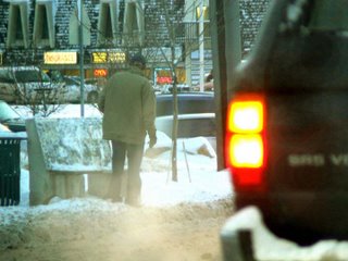
The first picture is of a man standing at a bus stop. I was going to crop out the tail lights if the car but I think it shows more of the coldness and you can see where the fog is coming from. I thought this represented cold very well because you can tell that he is bundled up and trying to stay warm.

This next picture is outside of my work and there was lots of steam from the fountain and there was lots of snow I cropped out a lot of the picture though because I thought it got more down to detail.

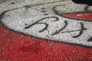
This last one I really liked because of the colors and the lines of the shoes that have walked through the snow. I thought it just looked like a really dead COLD picture. haha.
Monday, November 27, 2006
Friday, November 17, 2006
Thursday, November 09, 2006
Poem

The Cold breeze felt in all directions
White flakes whispering all around.
Fireplaces lit, smooke from rooftops
People walking around like eskimos
Winter is near
They know they cant stop your wrath
Chills are felt thoughout the city
Screaming children sliding down hills
Foggy breath seen all around
Only warmth is in the comfort of your home
The cold is upon us
Winter is here.
This is a picture of out my window when it was cold outside. I couldnt get a picture of snow but I thought this brought the winter effect.....There is a reflection of my room in the window too.
Tuesday, October 31, 2006
Friday, October 20, 2006
Friday, October 13, 2006
Friday, October 06, 2006
Friday, September 29, 2006
Friday, September 22, 2006
Friday, September 15, 2006
Green

For my post of green I decided it would be easiest to think of the most things known for being green. I was wondering areound outside and I realized "hoses are definetly green" and So i went and took a picture of it. I took a lot of picures of outside, and trees and many things like that and when i looked back over my pictures, the ones of the hose where better. I liked the shadowing and lines. I liked this one of the hose the best because I didnt have to do any editing to it to make it look better.
Thursday, September 07, 2006
My Room

I designed my room by putting things that I like in there. I put a poster of the Fray because they are my favorite band. I made it look somewhat crazy by putting all the random dots everywhere, because thats the type of person I am. I made the background of the window a concert because I love music, its my favorite thing in the world and I thought it added more depth. Everyone in the class noticed that I put nyself far away from the window and that it means that I distance myself from people and I dont trust people. It makes some sense. I also put a picture of a puppy because I love puppies


